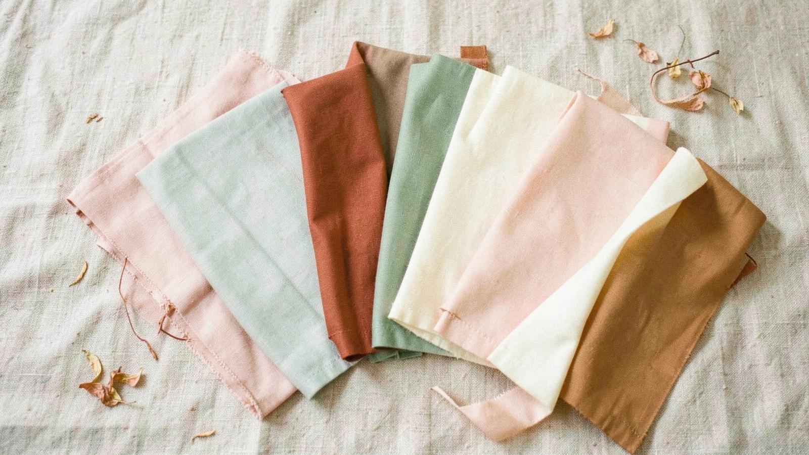
How to choose your wedding colors
A wedding palette isn't a mood board — it's a set of decisions your florist, stationer, and wedding party all have to work from. Start with the room you booked, not the images you saved.
The five inputs that decide your palette
The venue
Look at what you cannot change: carpet, wood tones, brick, stone, wall color, and the chairs. A palette that fights the room always loses.
The season
Light and foliage shift your colors. Spring reads fresh and pale, summer saturated, autumn warm and earthy, winter deep and jewel-toned.
The light
Outdoor daylight softens everything; candlelight warms and yellows. Check swatches in the actual light you'll be in, at the actual time of day.
Your style
A garden wedding and a black-tie ballroom can share a hue but not a palette. Let your overall style set the saturation and contrast level.
What you'll wear
Suits, bridesmaid dresses, and ties are the largest blocks of color in your photos. Choose the palette before ordering any of them.
Three palette formulas
The 3-color formula
One dominant neutral (about 60% — linens, walls, suits), one main color (30% — florals, bridesmaids), one accent (10% — ties, ribbon, stationery details). Safest and hardest to get wrong.
The 5-color formula
Two neutrals, two related mid-tones, and one accent. Reads richer and more designed, but needs a florist who can hold the ratio across every arrangement.
The tonal palette
Three to five shades of a single hue plus a neutral. Very forgiving in photos and currently the most requested look — think all-cream, all-terracotta, or all-sage.
Six palettes that work
These are the palettes behind the Lumière style archetypes. Take the quiz and we'll match you to one, then carry the colors through your plan.
Enchanted garden
Sage, moss, and soft blush — ideal for greenhouse, garden, or spring outdoor venues.
#e8efe6 · #a8bfa0 · #6c8264 · #f2dfe0 · #d9b8a4
Candlelit romantic
Champagne to deep burgundy. Built for warm indoor light and evening receptions.
#f6ece2 · #e3c9a8 · #c99a6e · #8c4a4a · #4a2c2a
Coastal sunlit
Sand, sea glass, and driftwood — bright, airy, and forgiving in harsh daylight.
#fbf8f2 · #dfe7ea · #9fb9c4 · #e5c9a0 · #7a8c96
Timeless ballroom
Ivory, gold, and charcoal. Formal, high contrast, and photographs cleanly under chandeliers.
#ffffff · #f0eae0 · #cbb69a · #8a8f9c · #22262e
Moonlit noir
Deep plum and midnight with an antique gold accent. Best for night weddings and dramatic rooms.
#eceaf0 · #8f8aa0 · #4a4560 · #241f33 · #c9a86a
Rustic country
Wheat, leather, and olive — built for barns, farms, and long wooden tables.
#f4ece1 · #d9c3a1 · #b08055 · #7d8b5f · #4b3f33
Six mistakes to avoid
- Picking a palette before booking the venue. The room's fixed colors override everything.
- Choosing a hue that clashes with skin tones. Bright yellows, neons, and cool greens are unflattering on most people in photos.
- Ignoring what's in season. Off-season blooms in your exact shade can double your floral budget.
- Too many competing colors. More than five reads chaotic in wide shots.
- Matching everything exactly. Slight tonal variation looks intentional; a perfect match looks like a uniform.
- Forgetting the reception lighting. Uplighting in a colored wash will change every shade in the room.
How to lock it in
- Order physical swatches in your top two palettes.
- Photograph them at your venue, at your ceremony time, with your phone.
- Pick the palette that looks best in that photo — not on your screen.
- Write down the exact hex codes and swatch names.
- Send them to your florist, stationer, rental company, and wedding party in one message.
Frequently asked questions
How many colors should a wedding palette have?
Three to five. Use one dominant neutral, one or two main colors, and one accent. Fewer than three reads flat; more than five reads chaotic in photos.
When should I choose my wedding colors?
After you book the venue and before you order attire or book your florist — usually 9–12 months out. The venue's fixed colors and your season should drive the choice.
What wedding colors photograph best?
Soft neutrals, muted mid-tones, and deep jewel tones photograph reliably. Neon shades, bright yellow-greens, and heavily saturated cool colors tend to cast onto skin.
Do my wedding colors have to match the season?
No, but the light will. A pale spring palette in a candlelit winter ballroom will read warmer than your swatches suggest, so test in the real light.
How do I get my vendors to use the right colors?
Send physical swatches or exact hex codes, not photos from Pinterest. Screens differ; a fabric swatch does not.
Ready-made palettes by wedding style
If you would rather start from a finished look, our seven wedding style pages each carry a full five-color palette with hex values, floral and tablescape notes, and a free moodboard PDF.